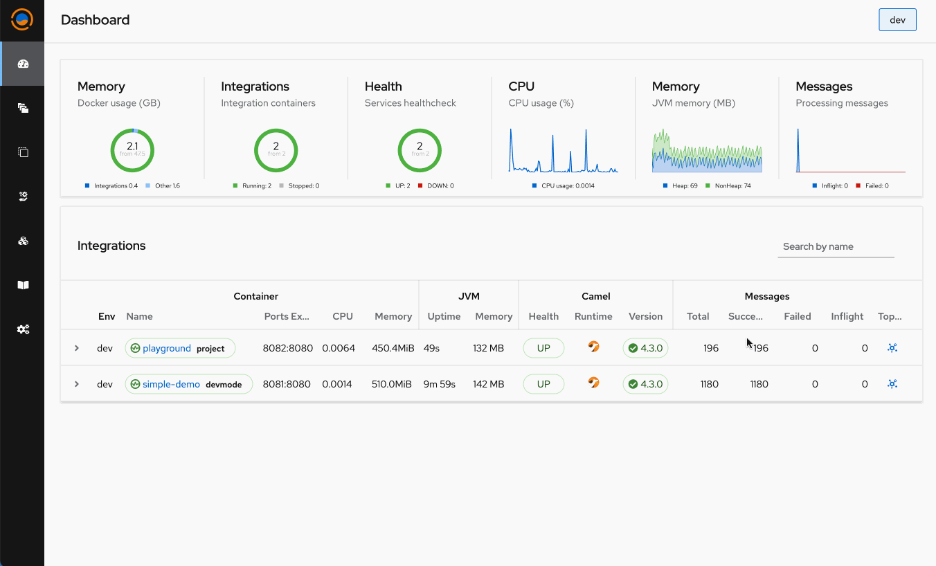
Topology Dashboard Metrics
We're thrilled to announce an exciting new feature in Talisman Platform, inspired by the insightful feedback from our great supporter Richard Stroop during last demo session for partners. This innovative addition is designed to enhance the user experience by combining critical metrics from the dashboard with an integrated topology view, offering a comprehensive and high-level diagram of routes orchestration. This feature aims to streamline the way teams visualize and manage their integrations, making it simpler to monitor, troubleshoot, and optimize workflows.
Key Benefits
- Enhanced Visibility: See at a glance how your integrations are performing, with key metrics overlaying the high-level integration diagram.
- Improved Troubleshooting: Quickly identify bottlenecks or failures in your integration routes by correlating metrics with the corresponding points in your topology.
- Streamlined Monitoring: Access all the information you need in one place, reducing the need to switch between tools to understand your integration health.
How It Works
The integration topology visualization provides a bird's eye view of your entire integration ecosystem. Each node and connection represents different systems, services, and the data flows between them. Overlaying this with real-time metrics from the dashboard, users can monitor throughput, latency, error rates, and more, directly within the context of their integration architecture.
This means that, for instance, if there's an unexpected spike in latency or a sudden increase in error rates, you can immediately see which part of your integration landscape is affected. This context-rich information empowers teams to make informed decisions quickly, ensuring smoother operations and a better end-user experience.